• Discover new ways to elevate your game with the updated DGCourseReview app!
    It's entirely free and enhanced with features shaped by user feedback to ensure your best experience on the course. (App Store or Google Play)

New Tee Signs*opinons wanted*

PA_Disc

Par Member
Joined
Jan 28, 2008
Messages
198
Location
Green Lane, PA
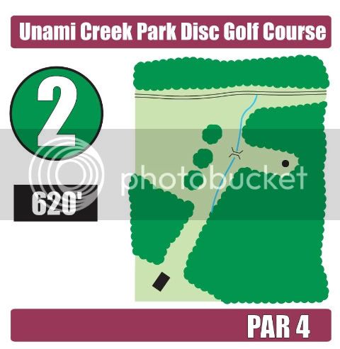
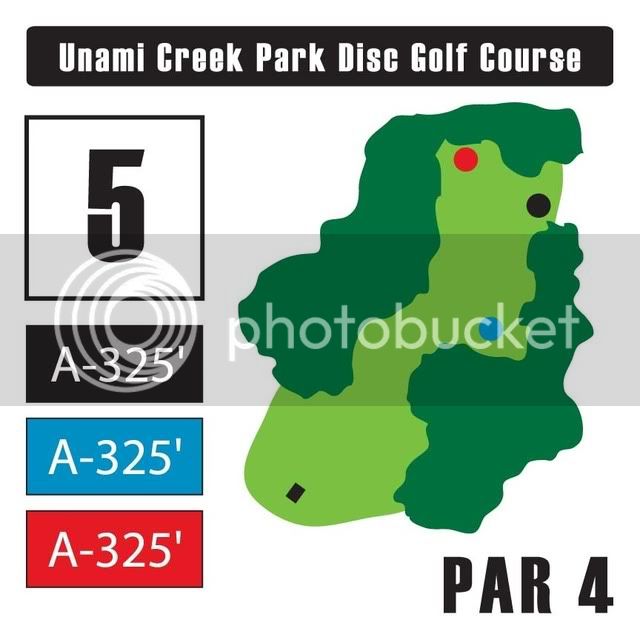
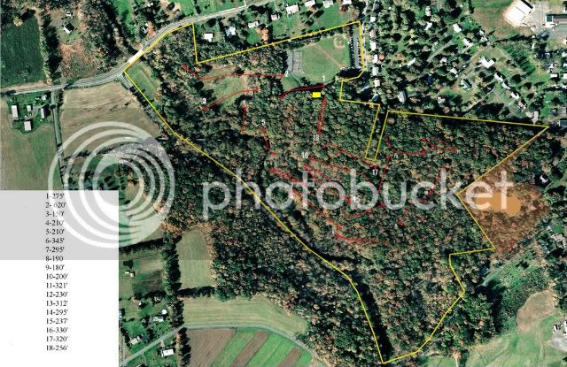
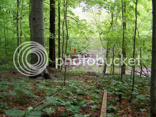
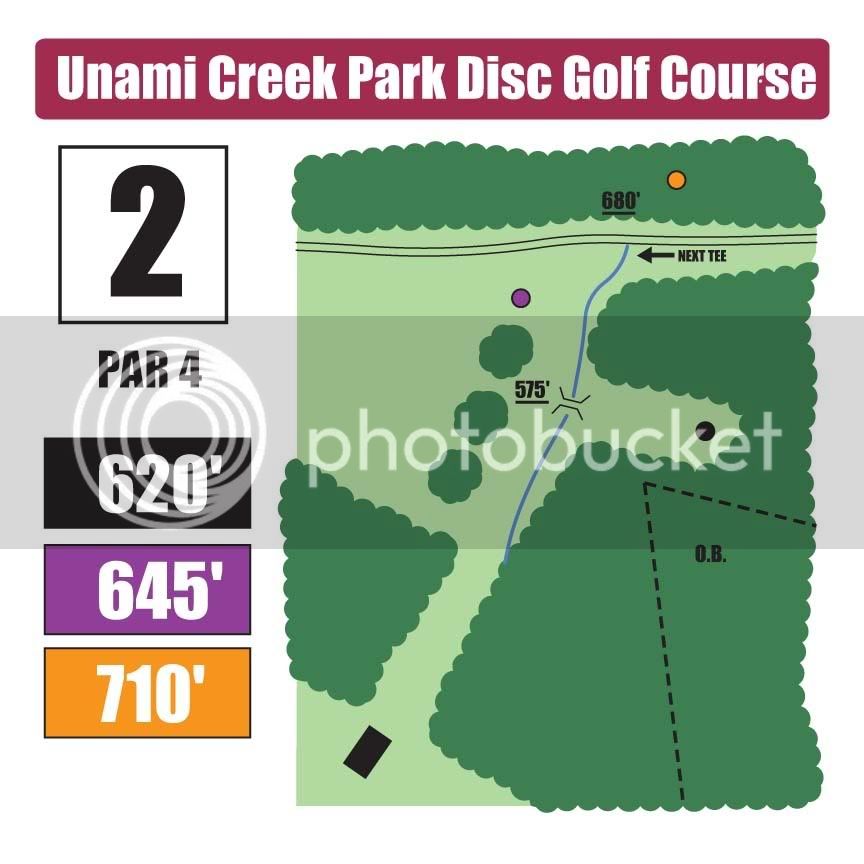
Hi guys, I am working installing a new course here in PA. I am nearing completion and have started working up ideas for tee signs. These are the current layouts that I have. I am leaving space below the first distance mark for future pin placements/distances. Please give me some feedback on what you think so far. I have thick skin, let me have it. :D

Hole2.jpg


Hole5_1.jpg


SIGN3.jpg
 
I liked the bottom one the best. Also, if you have some OB areas, It would be nice if you mark those either in the different color with OB on it or maybe a light XXXX black hash marks over the area with OB on top of that.

I know it is a little over kill, but I love it when the signs have some intermediate distances marked on them. Like if there is a single tree in the middle and on the tree it has a small number representing the feet to that tree from the tee. You see this on GPS units for Ball Golf. It would be cool to see that on disc golf signs. Just a thought.
 
I actually like the styling of the first one the best. I like the styling of the map more than the third one and I also like that the hole # and distances have their own section rather than being merged with the map like #2. If you could mix #1's map with #5's layout, that would be my vote.

Donovan's ideas about marking certain course features that stand out is a good one too.

Overall, all 3 look really nice. Good job :)
 
The first one is my favorite. And either marking out-of-bounds on the map or listing what is out-of-bounds would be a big help.
 
Donovan- I was planning on putting intermediate distances... I was thinking ball golf too :) OB- will be on there as well. However, there is only one OB that I can think of.

timg- You like the map on the first one, but would like it with the 3rd signs layout and colors?

Thanks for the help.
 
Mob, I like the first one myself. OB will be marked. Again, right now I think that there is only one OB for the entire course.

**I will probably be sticking with the Burgandy color for something as it is part of the park's color scheme**
 
timg- You like the map on the first one, but would like it with the 3rd signs layout and colors?

I like that the third sign has the distances in color although it was the only one with multiple pins so perhaps you'd do the same on sign #1.

You could also try losing the purple bar on the bottom, moving the par over by the distances somewhere and making the map bigger on the sign.
 
Alright, I will see what I can do. All of the signs would end up having the multi color distance markers once the alternates are installed, as shown in the third layout.

The signs are currently planned to be 12"x12" square alum.
 
Since we are talking about the new course, I figured I post up a course map.
-Note- some of the distances are not accutrate. Many of the hole have been lengthened since this map was done.
illustrator_layout.jpg


And a shot from the course. #4
UCP007.jpg
 
Like #3, it's like Eldo Park signs

I like #3 the best. Reasoning:
- I think the fine lines in the maps on #1 and #2 (especially the blue line on #1) would fade more quickly or be harder to see through plexiglass covers that are losing their transparency
- both maps #1-2 include more geography that is not a part of the course

#3 is visually simple, made from large shapes likely to stay readable after fade/wear, and provides basic information. I would add lines showing the preferred flight path from the tee to the holes, this would also aid in keeping the signs understandable as they age.

#3 is also a lot like the signs on my home course, El Dorado Park in Long Beach, CA. They are easy to understand and provide basic information. Agree a "next tee" arrow would be a nice addition.

- nex :eek:
 
I liked the first one best. I think a good addition to signs is an indication of where the next tee is.
 
Thanks for all the input guys. I will add next tee arrows to the signs. I was actually planning on having directional signage at the baskets to indicate the next tee. Do you think I should show it on both the sign and by the baskets? The preferred line... Is it really all that helpful to have this on the sign? Really, 90% of the time the fairways are visible... I will give it a try to see what it looks like.

Keep the comments coming. Thanks.
 
Both would be cool as often times I'll forget to look for the next tee on the tee sign since I'm used to that info not being included a lot of the time.
 

I'd like a mix of signs 1 and 3.
On #1 I like:

  • plum colored header with course name
  • map layout
On #3 I like:

  • *Best feature- Hole lengths color coded by level!
  • Hole number- bold and black
  • Par- black and clear
  • No footer
The map on #3 isn't distinct enough.
 
Very nice.. my only suggestion would be to see how white text in the dark areas (ie. the OB line) to make it easier to read.
 
Top