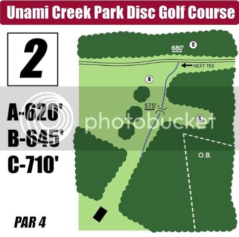
On hole lengths-- I think it's probably best to list the lengths rounded to the nearest 5 ft. (or even 10 ft.) When players are driving knowing that it's 285 (or even 290) is good enough. It doesn't help to know that it's 286 because no one throws that precisely. When I read 313 ft then I translate it in my head to throw something 310. Also, there are too many variables with measuring distance to make measuring to the foot meaningless. e.g.- it's fine to use line of site with a laser, but on curved holes the length is longer because a disc follows the curve. Elevation changes also affect the measurement line. To me, just having the lengths rounded to 10s is sufficient. Actually I chuckle when I see signs that aren't rounded because I know they're not that accurate.
I had this debate with a guy in town here too a while back. I've only been playing this sport for six months now so I'm more than willing to listen and learn from those more experienced than I, but... I've been making new maps for all the Houston area courses and I'm doing almost exclusively line-of-site measurements.
When I did the laser accurate measurements for TX States people loved them. There were lots of comments how nice it was to have super accurate values, especially on water holes where "wheeling" the distance is always a problem.
Whether they really can or not, there are pros that will tell you they'll throw differently on a 282' hole vs. a 287' hole.
You're correct that curves and elevation do add significant distance to line-of-sight values. However, my opinion on that is similar to the "recommended flight path" line on tee signs. If you measure a distance along a "recommended flight path" around some trees and a player decides to go over the trees instead the posted distance isn't valid for him.
My ideal preference would be for every hole to list the GPS, or line-of-sight distance to the hole and let the player make the appropriate adjustments for changes in elevation or desired flight path. You can't know how a player will approach a basket, so don't make assumptions on distance for him, just give him the raw information and let him make his own decisions.
Anyway that's just my $0.02.
Actually I chuckle when I see signs that aren't rounded because I know they're not that accurate.
Funny, I do the same thing with signs that
are rounded for the same reason.
 ) so I'd put the par down in the lower right corner (as in the original #3), instead of in a prominent place.