• Discover new ways to elevate your game with the updated DGCourseReview app!
    It's entirely free and enhanced with features shaped by user feedback to ensure your best experience on the course. (App Store or Google Play)

New Shirt Company - Big Ol' Hyzer

Joined
Apr 27, 2013
Messages
16
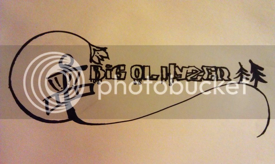
Big Ol' Hyzer Disc Golf Clothing just joined Facebook and is posting up pictures from start to finish - concept sketches, marker drawings, vector renderings and t-shirt art proofs.

Check us out when you get a chance!
www.facebook.com/BigOlHyzerDiscGolfClothing

Sorry if I'm posting this in the wrong section, I figured equipment would be best suited.
 
BohLogo.jpg

Check out this picture we're thinking about using as our logo.
 
Last edited:
Really not feeling the name tbh.

Where's the creativity these days?

"Oh it's disc golf related we might as well throw the word Hyzer in there somewhere!"
 
It's something I say every time I throw a hyzer... 'I'm gonna throw a big ol hyzer' and it's what I'm going with. I was sure there would be criticism both ways and that's what it's all about is getting feedback (whether I want to hear it or not, lol).
 
I'll try and strike a more respectful tone here. I appreciate that disc golf is growing and more people are getting into the apparel/bag/everything scene. But my main concern is that this company is going to run into trouble from Big Hyzer Bag Co. The names are just way too similar.

I wish you guys luck, but a name change might be in order to avoid issue.
 
It's something I say every time I throw a hyzer... 'I'm gonna throw a big ol hyzer' and it's what I'm going with. I was sure there would be criticism both ways and that's what it's all about is getting feedback (whether I want to hear it or not, lol).

Here's some positive feedback. That logo is alright (bar the company name and how that's written). If you polished the lines up it would make a great t-shirt design. I dont know if it should be your main brand logo. But it would make a nice shirt

The name MIGHT be sentimental to you, but think about how many companies have hyzer in them already (Hyzer Bomb, HyzerFarm, etc...) What sets you apart from all of them?

Plus, Hyzer is an ugly word. I love it to describe the specific hyzer shot, but it's aesthetically ugly. A y and a z together just exudes 1990's forced extremism and radicalism. Like COWABUNGA or XTREME!

take my opinion for what it's worth, I am a graphic designer by trade
 
Name Idea: "Anhyzer, Anhyzer, and Hyzer" Just kidding

Start selling bongs too, and change the name to "turn & burn" another joke

Change the logo to an upside down Nike swoosh, and rename the business "Parabolic mark"

To be somewhat helpful and serious though, the logo has too many contrasting elements in it. There are graffiti aspects, blood drops?, the tracing of a French Curve, stick-figure trees, and a basket that looks almost identical to another company's trademark. It's just too much crammed together to be a unified representation of a business.

Just my jokes and opinions, so take it for what it's worth; I'm also a graphic designer and artist.
 
Agree with the sentiment above - clean the lines up on the text, maybe drop the dripping as well and you have a cool shirt design. I would not do that for a company logo - it's pretty busy.

Also agree with rethinking using Hyzer at all.
 
Who does an oriental basket design? im seriously not trying to rip anyone off with what I'm doing and I've already decided to change the name to avoid conflict with any existing dg companies.
 

Latest posts

Top