• Discover new ways to elevate your game with the updated DGCourseReview app!
    It's entirely free and enhanced with features shaped by user feedback to ensure your best experience on the course. (App Store or Google Play)

Disc Golf Data Visualization

SocraDeez

Par Member
Joined
Apr 5, 2020
Messages
211
Location
Indiana
Just wanted to share a couple graphics I made recently that describe "disc golf data". Here is a league attendance heat map for 2021. Blue is more; red is fewer. Max ~ 60; Min. ~ 5. Data from UDisc.

League-Attendance-IDGC2021.png


And here's a map of player-cities from a recent tournament. Data from the PDGA website (of course, a player's PDGA registered city,state info. is not always up to date).

Map-Screenshot-V1.jpg
 
The Indiana map is very cool. :clap:
The heat map thing just hurts my brain. :D
 
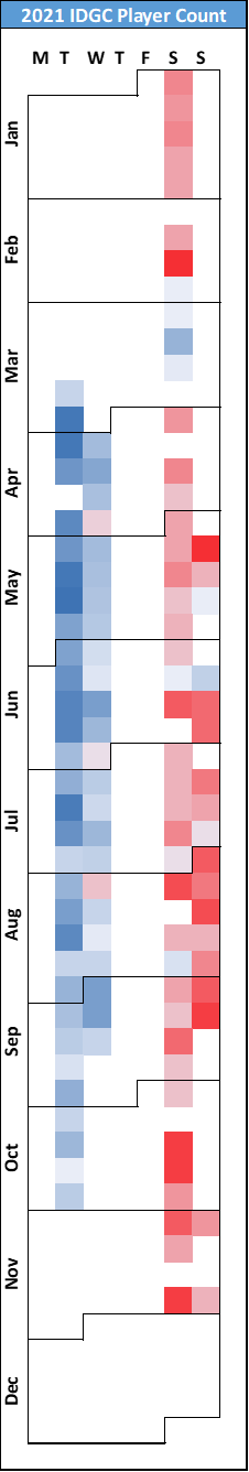
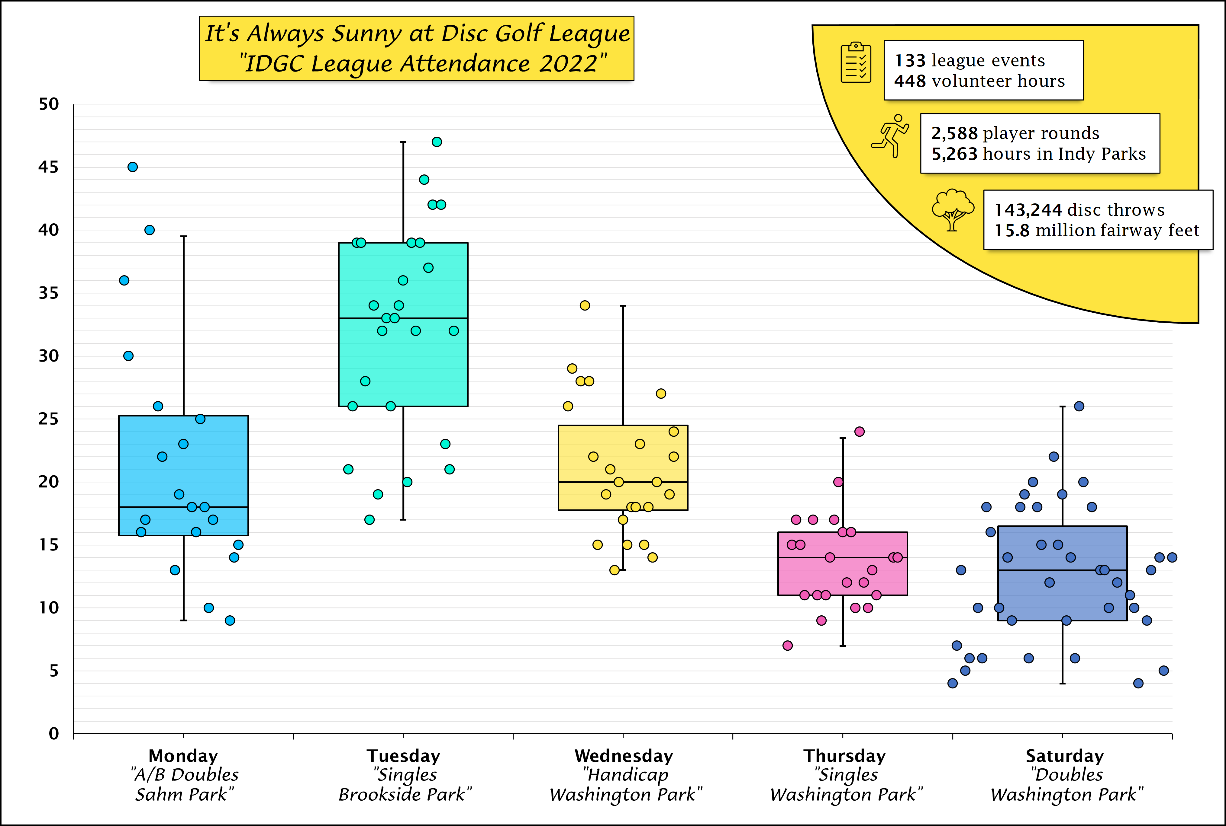
Appreciate the feedback. From a club perspective, the v1 heat map above can provide a quick summary of league participation. At a glance, the after-work-weekday leagues draw the most players. There also might could be a first-nice-disc-golf-weather-of-the-calendar-year effect: Saturdays drew the most players in March.

The Tuesday and Sunday leagues are at the same park. The Wednesday and Saturday leagues are at the same park. Tuesday, Wednesday, and Sunday are singles format (w/ Tues & Sun being division based competition while Wed. is handicapped competition). Saturday is random doubles.

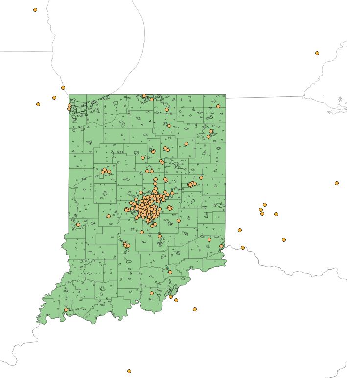
I'm fiddling around w/ this data & graphics and stuff with an ultimate aim of including some of it in future course proposals. The audience then is more so non-disc golfers & Parks/ City officials. The state map is semi-obvious: All those dots visited the City because of an non-profit organized event at one of/multiple City disc golf courses.

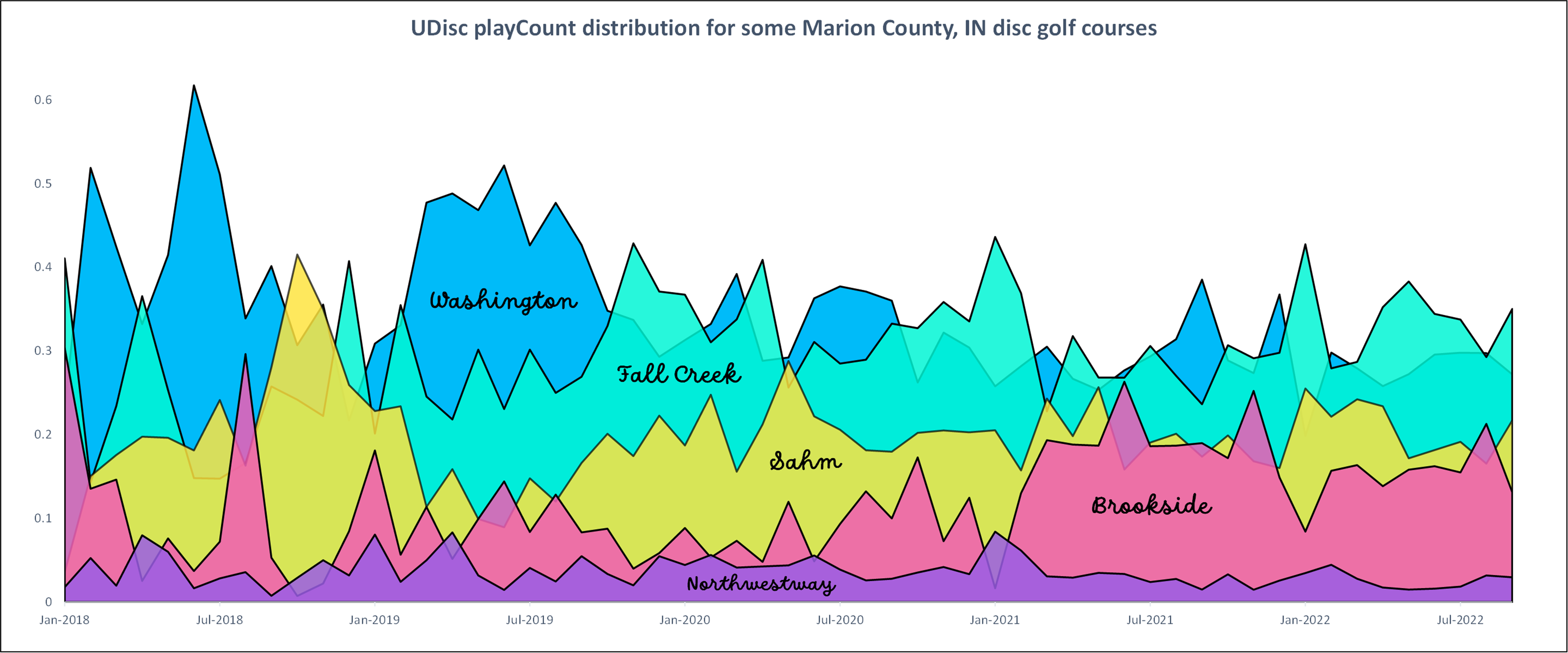
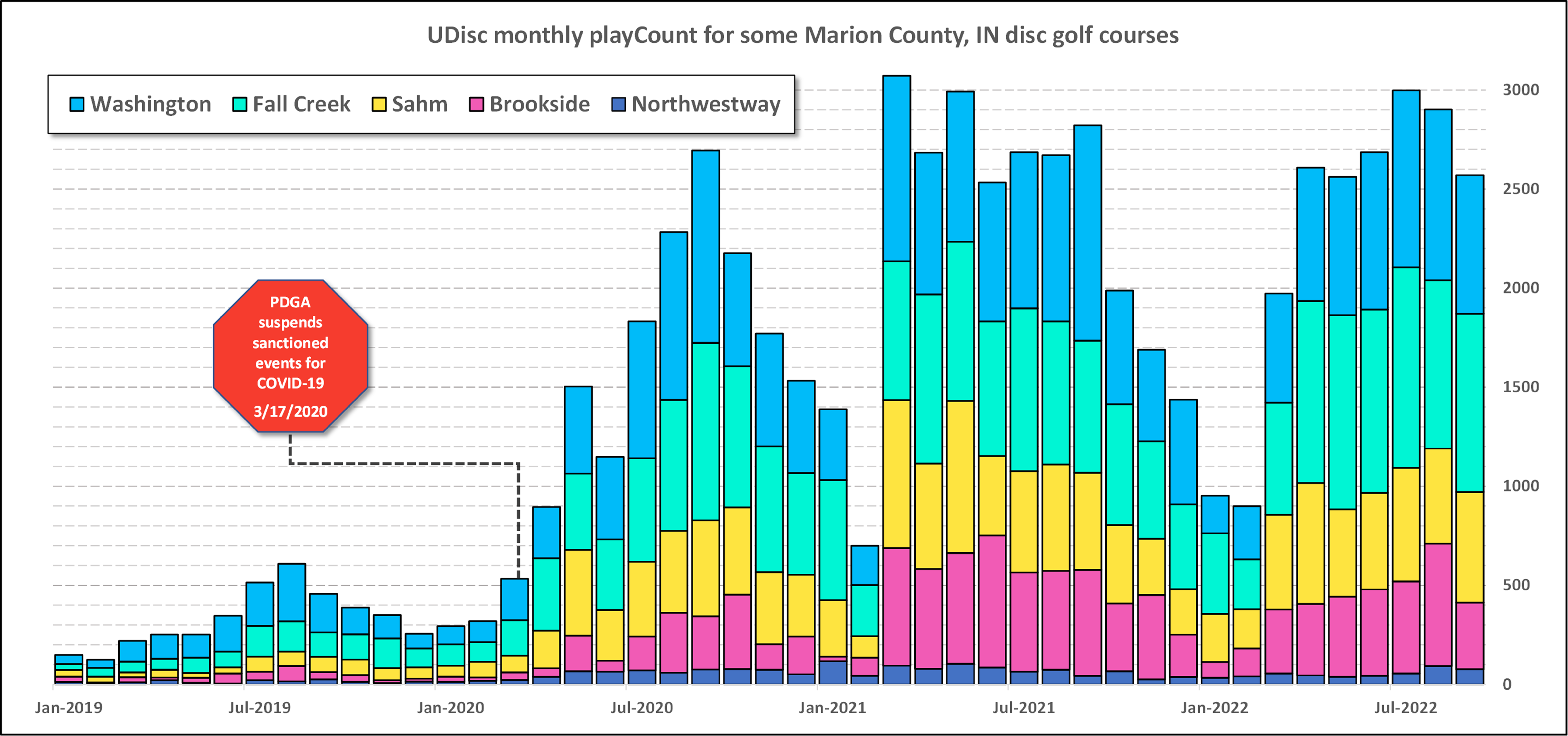
For the calendar heat map, the goal is a quick visual representation of all the people that visit the Parks for a club-organized disc golf event like a league. A core part of Parks' "Master Plans" is getting people in the parks. Disc golf courses bring people to the parks. How many? No one knows exactly. Well, here is one measure: all the days marked on which people visited the parks to participate in organized disc golf competition + a scale of magnitude of participation (the colors & gradients).

I don't think many non-disc golfers know that disc golf courses can provide year round recreation. Plus disc golf leagues and events are often not a part of official Parks programming and can fly under the radar.

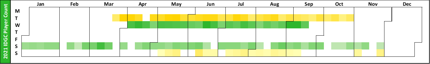
I think the calendar graphic idea is sound, but there's definitely a lot of polishing left to be done. Here's a v2 heat map transposed to run horizontally. The Green represents one park where leagues are held. The Gold/Yellow represents another City park. For sure still needs some fine-tuning. Will probably add in Tourney data points once I figure out how to best scrape it off UDisc/ PDGA.

Image weblink: https://ibb.co/9VnfVm8

League-Attendance-IDGC2021-v2.png
 
I think the horizontal presentation is easier to understand. I also think red, orange or yellow should represent hotter/bigger/better numbers if more than one color is used.
 
Your chart doesn't surprise me.....it's what I would expect.

I'm not surprised League play is low on Sundays. People are at church, watching NFL games, and quite frequently Sundays are family time. Weekends are also 'get away' times if people are going to travel.

March being a low league time isn't surprising either - it's March Madness time.

Depending on the location, Nov through March is cold weather....people aren't playing disc golf...they might be out skiing. It's also darker sooner then, which makes playing after work harder.

we have had quite a few different leagues on Sunday's in the area over the past year in which this data is compiled. I tell everyone before they run it to not get discouraged when your attendance isn't what you think it should be, Sunday isn't a good league day in this area.
 
I was confused by the colors at first in the first heatmap. It says red is less and blue is more, but I didn't know if that meant dark red was in the middle or if light red was in the middle because the 2 colors represent different things on the second heatmap. For me I think just a line graph of each day would be easier to understand lol. Or maybe just put a scale in showing what different colors mean in terms of numbers.
 
More diddling with data: here's an area chart graphic that plots monthly UDisc playCount* distribution over time for some local courses. Probably need to bin the months into "seasons" to smooth out the dist. peaks/spikes during Jan/Feb.

*
I don't actually know what UDisc is counting database-record-wise to produce the "playCount" number, and I haven't been able to get a detailed answer from them on that point.

UDiscplay-Count-Dist-Graphic.png

What's the recent bump at Brookside about?
 
There was some construction - related to the waterway in the park, Pogue's Run, and Combined Sewage Overflow (CSO) reduction - that made part of the course unplayable. Finished ~ Spring 2021.

https://citizensenergygroup.com/Our-Company/Our-Projects/DigIndy-Related-Projects/Brookside-Only-(F)

CEDig-Indy-Brookside.png]


Brookside has nice equipment (targets/pads), but still needs Tee Signs. The layouts can be confusing (I missed half the course first time I played there last year), and I'd wager that hole design probably steers some rec. level players toward Washington ~ 10 min.s away. But Brookside is also our/the Club's most flexible-&-suitable-for-serious-competition course.

I've got UDisc playCount information for the above courses since 2013. Anybody got any sexy ideas? Especially, ideas w/ a Parks Dept./ non-disc golf enthusiasts as audience.
 
Here's a league attendance graphic for our 2022 season. Classic boxplot (an imperfect champion of the easy-to-draw-by-hand chart era) overlayed with some dots. Jitter of the dots for each category scaled to weeks of year during which each league event occurred.

I know that the boxplot boxes look more like doublewides, but I wanted to include some seasonal information so needed the additional wide. The dots can be read left to right as a time series for each league category. Left side of each colored box marks first week of league "season" in 2022 (~ week 13, about the end of Mar/start of Apr) and right side of colored box marks last week of league "season" (~ week 40, about the end of Sept/start of Oct). Saturday league runs all year long.

Image weblink: https://ibb.co/xfW92fG


2022-It-s-Always-Sunnyat-League-Graphic-v1.png
 

Latest posts

Top