• Discover new ways to elevate your game with the updated DGCourseReview app!
    It's entirely free and enhanced with features shaped by user feedback to ensure your best experience on the course. (App Store or Google Play)

DGDave's Dyed Disc Depository

dgdave

* Ace Member *
Joined
Jan 15, 2007
Messages
13,138
Location
Norman, Ok
What's a good few designs to start learning process? I have not the most artistic bones in my body when it comes to drawing and such.

Just got some vinyl, about to head to hobby lobby for some blades and dye. Walmart was out of both. Go figure. Maybe that was a sign. Or a ton of other people wanted to start dying.
 
Keep it simple. circles can be challenging. Basically just use google images and type in what kind of picture you want to do. For example for an eagle try eagle art or eagle tatoo or something like that. Then look for something that is fairly basic.
 
I'm about to take my first shot at it too. I'm thinking I'll probably base it off of a 50's cocktail-loungey-mod image, the big-blocked color fields with bold black lines over it seems like a good way to start out with multi-color without having to do a lot of fine detail work, and if your registration's off a little then that's okay :)

This one, for example, seems good for a first shot at it? (I'm imagining two masks, with some of the red-brown mask coming off for the lighter red shading.)
 
Avoid thin lines, perfectly cirular or long straight lines, and small cut-out areas and you should be pretty successful. Cartoonish stuff almost always comes out well, and you can re-cut without it looking dumb if you make a mistake.
 
That didn't go so well. The cutting wasn't bad. I messed up transfering it. I just went with it after that. There was a lot of bleeds because of the transfer problems. a lot of the bleeds on the edge are scuff marks that were already there.

I'm happy with the way the black came out.

IMAG0166.jpg
 
Dave, you should take some high-quality pics before that gets blurred. That dye has a crazy visual effect: To my eyes, it looks like I'm scuba-diving in a pan of Rit, looking upwards through a clear disc that is being dipped. You can see the dye sneaking under the wrinkles and folds of the valiantly-efforted vinyl application.

Dave, tell us how you applied the stencil to the disc step by step, even if you think it's an insignificant detail. Someone here will have good advice.
 
For whatever reason, I tried to appy the vinyl to the disc instead of the disc to the vinyl. Since I had some thin strips, some tape ont them to keep them straight would have been very beneficial. I realized it was off center last second and tried to pull it off and that got all the strips in tanges so I just stuck the bastard down and wanted to see what it'd turn out like.

I just got very excited. I had pretty straight lines for freehanding the cuts. Just part of the learning curve.
 
so you didn't use transfer tape? you goon. Use transfer tape for everything, even as coffee sweetener.
 
This is addictive! I've got one more cut out waiting to be dipped after dinner, 3 more ideas, and more vinyl on the way!

I may try to cut one more and dip the 2 tonight. Nothing spectacular, but ya gotta start somewhere.
 
Another dye on an ion...

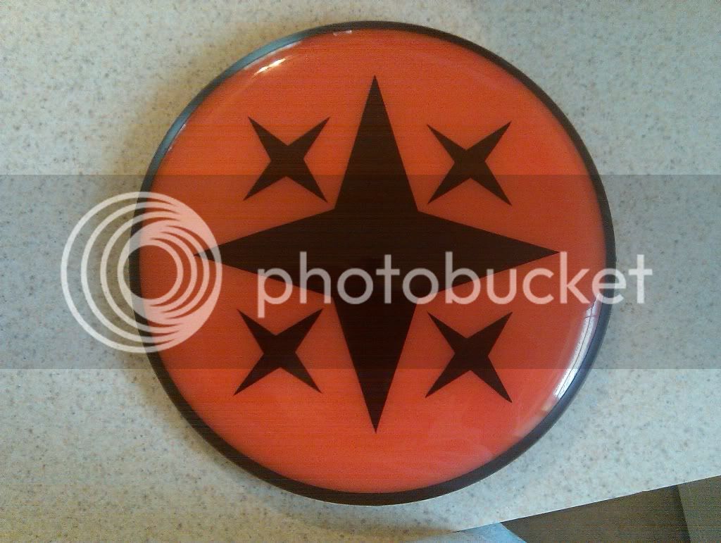
This one is much better. And to scale. Wish I would have tilted the smaller arrows in, but the disc is supposed to fly straight so it works.

IMAG0169.jpg
 
Good looking dyes dave.

I'm not very artistic either but one thing that worked for me was some of those vinyl letters from hobby stores. I bought a variety pack and made some pretty funny stuff. The only problem is then the letters are the color of the disc and the background is dyed.
 
looks like those ions hold the dye very well. Nice job on the discs they look good to me if you would not have mentioned the stars I would never have noticed.

CHEERS - Koffee
 
Just drew this out to try curves and letters. Gonna clean up the letters, cut, and dip in the morning.

IMAG0170.jpg
 

Latest posts

Top