• Discover new ways to elevate your game with the updated DGCourseReview app!
    It's entirely free and enhanced with features shaped by user feedback to ensure your best experience on the course. (App Store or Google Play)

US map showing density of course in each state

Lewis

* Ace Member *
Joined
Sep 18, 2008
Messages
4,484
Location
Marietta, GA
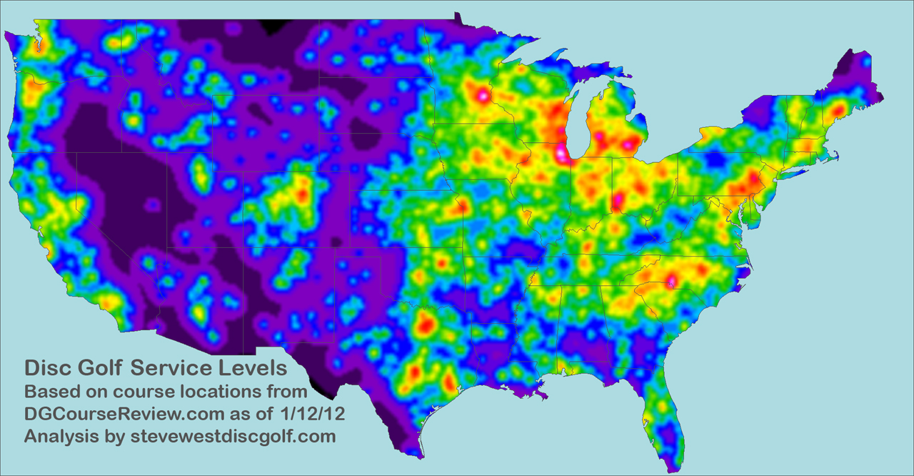
I've been wanting to figure out a way to show survey data by state, like you see in all those infographics on the internet about who says "soda" and who says "pop". After some research on how to do it in Excel, I finally figured out a way. While doing this, I created a map to show the density of disc golf courses per state, which I've attached as an image. I was kinda surprised to see how well, for example, Delaware, which has only 12 courses, compares against Texas, which has over 300, when you adjust for land area. Check it out and see if you notice anything interesting.
 

Attachments

  • dg-course-density-of-states.png
    dg-course-density-of-states.png
    95.3 KB · Views: 1,065
The map looks a little better against a white background (open it in a new browser tab), because of the transparent color setting in the image. I should have turned that off when I saved it.
 
That is interesting. I'm surprised NH isn't more red, but we are a pretty small state.

Another interesting way to go about it would be to look at number of courses within X miles on any point on the map. So rather than state-by-state, you would have gradients that darken in high density regions, and lighten in lower density areas. I imagine that would be a very difficult map to make though.
 
it'd be nice to see a scale so that i know what the various colors represent.
 
That is interesting. I'm surprised NH isn't more red, but we are a pretty small state.

Another interesting way to go about it would be to look at number of courses within X miles on any point on the map. So rather than state-by-state, you would have gradients that darken in high density regions, and lighten in lower density areas. I imagine that would be a very difficult map to make though.

Yeah that would take a lot of time and data, and I'm not sure Excel could handle as many tiny little shapes as you'd want to use. You might could do it by county, but I don't have any easy way to look up courses by county.

it'd be nice to see a scale so that i know what the various colors represent.

Sorry I omitted that. The state with the least course density (Alaska) is the reddest, and the state with the greatest course density (Delaware) is the greenest. All the others are colored according to their relative density vs. Alaska and Delaware. I suppose I could set it up on an evenly graduated scale, but I haven't done that with the spreadsheet at this point. Maybe I can share an updated version if you want, or share my spreadsheet and let you tinker with it.
 
More specifically, Delaware has > 6 courses per 1000 square miles, and Alaska has less than a course per 20,000 square miles.
 
Yeah that would take a lot of time and data, and I'm not sure Excel could handle as many tiny little shapes as you'd want to use. You might could do it by county, but I don't have any easy way to look up courses by county.

Doing something like that would probably require some sort of custom software. You could choose the resolution and scan through each "point" on the map and count how many courses are within a specified radius.

Definitely more work than plugging numbers into excel.
 
this is a great example of how geographic analyses shouldn't be done. Try making a heat map by using a much smaller geography
 
I'd like to see it with pop density. For instance, the eastern 2/3 of OR has about 1/10 of the entire state pop., and most of the DG courses are located with the other 9/10 in the western 1/3.
 
this is a great example of how geographic analyses shouldn't be done. Try making a heat map by using a much smaller geography

As I suggested previously, I don't have access to the data to do that. Got a list of courses by zip code?

I'd like to see it with pop density. For instance, the eastern 2/3 of OR has about 1/10 of the entire state pop., and most of the DG courses are located with the other 9/10 in the western 1/3.

Yeah that's the weakness: I don't have any easy way to break down the states into smaller districts. This is for fun, not for science. :)
 
Steve West has had this whole thing covered for quite some time now. Although I think he needs to upgrade his map since its two years old.

http://www.stevewestdiscgolf.com/About-Us.html

DGServiceLevels2012.jpg
 
Top