• Discover new ways to elevate your game with the updated DGCourseReview app!
    It's entirely free and enhanced with features shaped by user feedback to ensure your best experience on the course. (App Store or Google Play)

[Innova] New look of Innova Champion

The prominent placement of "Champion" makes me think they're going to roll this stamp out on other plastics :(

The multiple bubbly fonts are toy-like and killer on the eyes. I like the circle concept, might put some interesting dye's in the middle there, but boy, that's a busy, ugly stamp.
 
Put me in the minority that likes the look.

The plastic sure is nice.
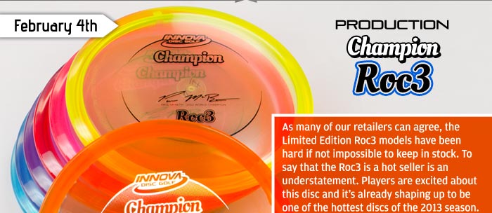
i like the look but why not have a cool DX like stamp, i kinda thought maybe a lot more effort would be in getting new young players to want to play???

do you think a kid is going to need that disc with that stamp?

Now if you put a cool stamp on it maybe that would get it off the shelves.

Its called marketing...stop giving away 200,000 dollars to edge for one on one leasons. Marketing works.
 
Beyahahahahaha, as if the flight numbers crammed on the disc didn't make it ugly enough without ridiculous bubble lettering littering the disc.


Glad I bougth my Big Bird Roc3's, after looking at this ugly garbage:
row7-a.jpg
 
Who will be the first person to get the Stock Stamp Roc3 acetone everything off but MCBeth's signature and start selling em on ebay as "Super Duper Rare McBeth Signed Roc3"?
 
Who will be the first person to get the Stock Stamp Roc3 acetone everything off but MCBeth's signature and start selling em on ebay as "Super Duper Rare McBeth Signed Roc3"?

*Stops doing JUST that*
 
Hideous stamp, but the plastic is prettier. At least they got that right (by ripping off Lat 64). If I like how a disc flies I could care less how it looks though.
 
Old Champ stamps are ugly, and so are the new ones. They should hire me to be their graphic artist.
 
meh...as long as they fly like they should I will get over it. Its not like the old stamp was much better. Just acetone parts of the stamp and it will look fresh. You will be the first on your block with a custom look. ;)
 
I like to wipe or selectively wipe the stamps off of pretty much all of my discs.

This new champ stamp doesn't bother me in the least.
 
They've got several talented artists over at Innova and I feel their need for something universal and corporate-fun. Still... the whimsical font age is over, and that font don't cut it. Star is more "now" than this one. But I'd rather see factory artwork err on the side of childlike than on the side of angsty. And that new D-Line was me, so I've been through this exercise recently.

completely agree, stay away from the angst pleeeasssse
EXTREMEEEEE
 
This new Champion looks just like MVP's Proton, right? At least, from the pics, it does.
 
If they come out like the Totem ones they'll be pretty overstable.

I have a Beast in this plastic, but the old stamp that I'm now happy I'm not throwing.
 
After a few looks I would like 1.) Change that bubbly font and 2.) Move the "Champion" to the bottom part of the face so that it reads "Champion ______" like how it currently is and has been. Other than that it looks fine to me.
I am intrigued on the grippiness of this new blend of plastic. Sure looks nice, but hope it has some grip and isn't slick as it looks.
 
I'd buy some production champy-star blends.

Not a fan of the font and hate all flight numbers. Plastic looks nice and clear but is it grippy, stiff, gummy?
 
Top